The brief
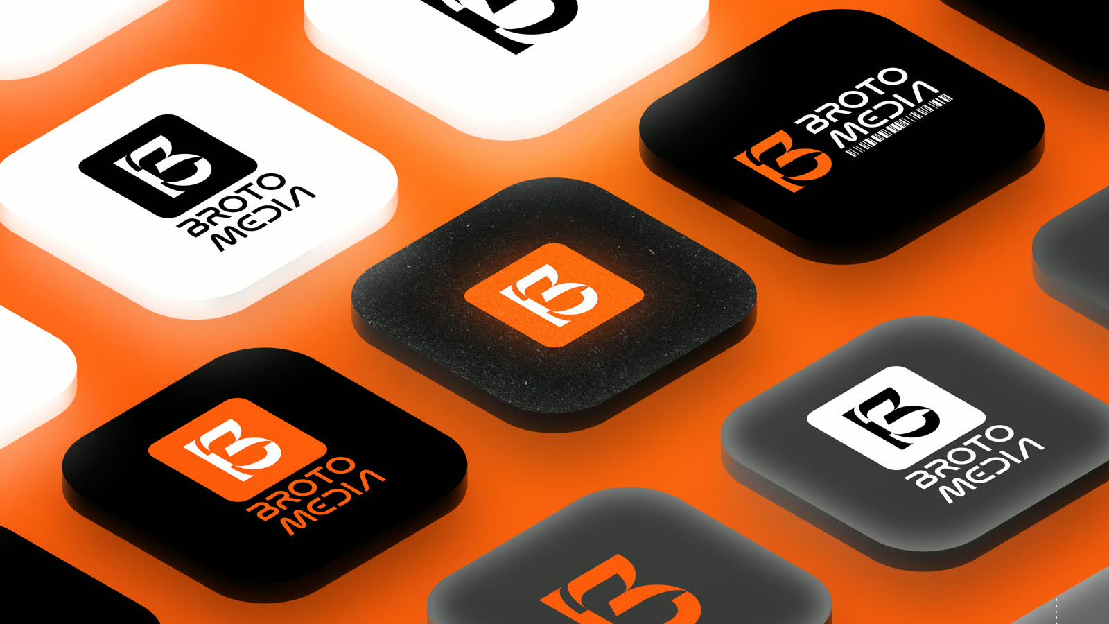
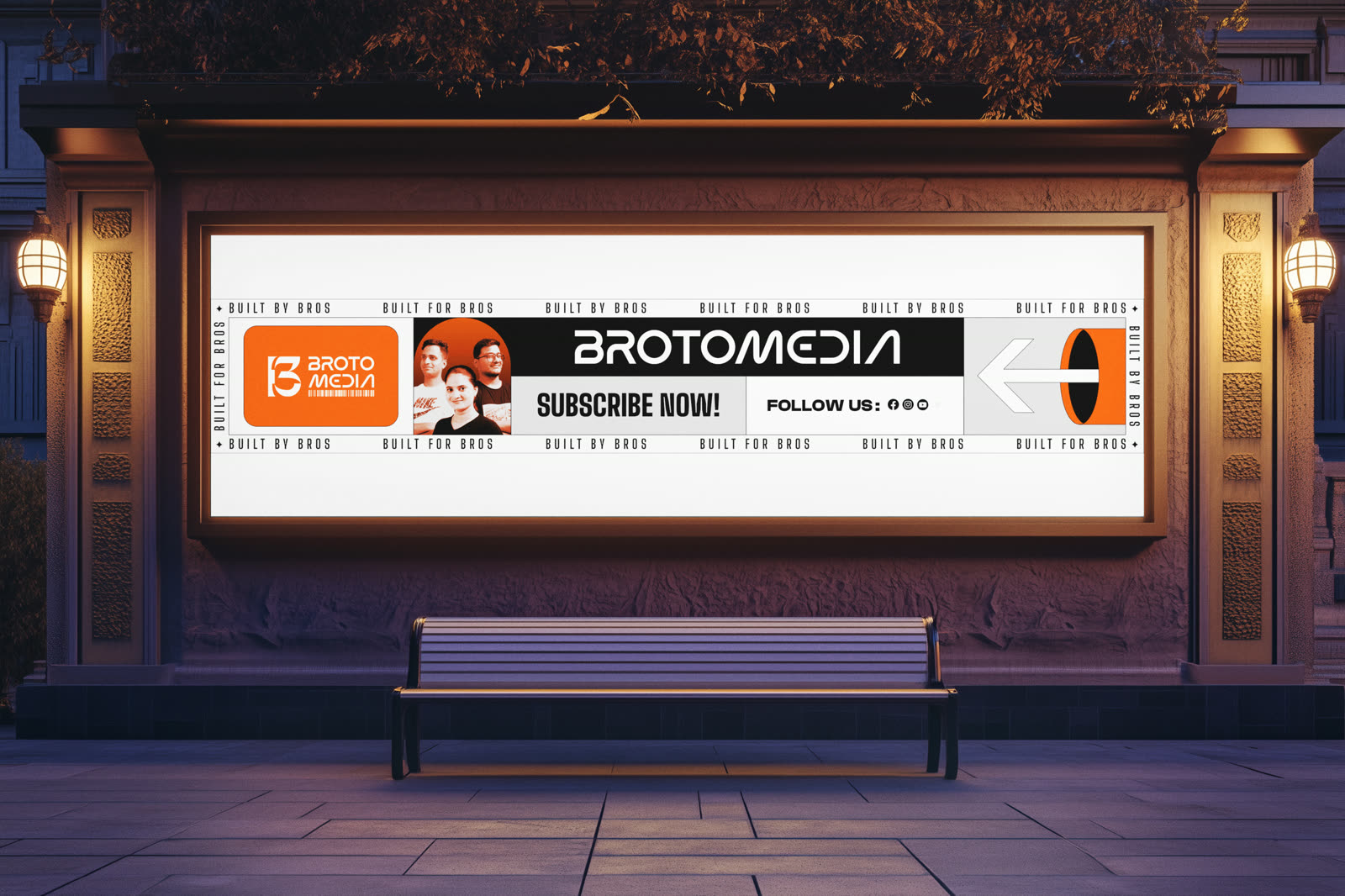
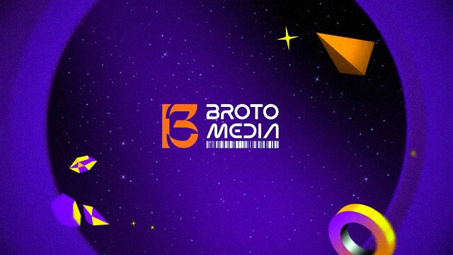
Brotomedia is a bold, creative-first content house that thrives on humor, storytelling, and digital charisma. Positioned at the intersection of entertainment and engagement, they needed a logo that reflects their youthful energy, sharp attitude, and standout presence across digital platforms. The goal was to craft a visual identity that would not only resonate with their audience but become a recognizable symbol of their unique voice in the creator economy.
The thinking
The challenge was to create a logo that strikes a balance between playful and professional, something that embodies Brotomedia’s edgy, meme-friendly tone while still standing strong as a scalable brand asset. The logo had to be instantly recognizable across formats, adapt well to digital media, and carry the personality of the brand without overcomplicating the design. The process began with strategic discovery, understanding Brotomedia’s audience, tone, future vision, and digital content patterns. I explored several directions that played with visual metaphors of a “bro culture,” digital storytelling, and media dynamism. Typography exploration led us to the clean, futuristic Moon Light font, balanced with the approachable Supera Gothic for supportive brand messaging. A minimal, high-contrast palette of #FF5102 (orange), white, and black was established to communicate vibrancy, clarity, and boldness across platforms.
What I did
My role: Brand Designer, Brand Strategist, Logo Designer, Visual Identity Designer. Tools: Adobe Illustrator, Adobe Photoshop.